DIY Weather Prediction (Okinawa) Part 2
After all my family members fell asleep in the cosy hotel, I sneaked to the balcony (where there was light other than the toilet, hmm, not my choice) to check the result of the prediction.
Subtitle available: English
You can simply explore the usage of Jupyter Notebook for visualizing and analyzing results by
- Click the "Visualization" link on the menu after you sign in CPAS.
- Click "Start My Server" to run your Jupyter environment with resources given according to your subscription privilege. Free Sign-up users also have access.
- Open the notebook desired — the .ipynb are intuitively named.
- Follow the instruction therein!
[Watch the video for how to do it.]
I executed the block of short code I wanted, and chose the simulation job. Just a few clicks from my fingertip. Then, I executed the block of code that brought out an interactive map panel. I zoomed in to Okinawa, and chose the time slice, hmm, 2019-12-22_06:00:00 (which corresponds to 3pm Japan Standard Time). I choose the "t2m" variable (temperature at 2m height) and clicked the "Draw" button, waited for a few seconds, here came a color map visualizing the temperature. But the default color map range is a bit wide. I clicked "Auto Adjust Range" to automatically fit the range and now I saw differentiating colors for different parts of Okinawa.
[Not in the video]
In addition to doing plotting and visualizing variables in mesh cells interactively, the Jupyter environment can be used to analyze the result, for newbies and professionals.
I got a csv file for a week's observation data at the Naha airport (from rp5.ru, thanks!) covering my real simulation period, then I uploaded it to the Jupyter environment. I used the following piece of code to compare, or evaluate, speaking professionally, the real simulation result against the observation data.
import numpy as np
import pandas as pd
from datetime import timedelta
from cpas.evaluation import ModelEvaluation, csv2df
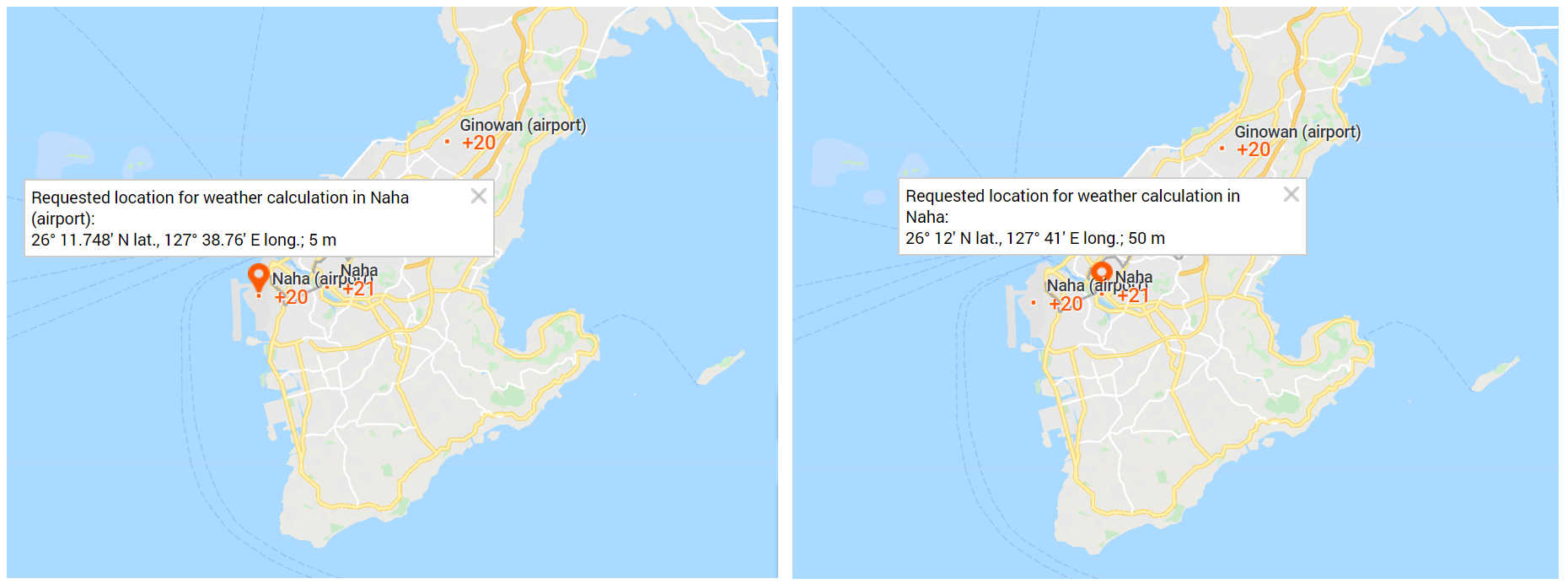
(my_lat, my_lon) = (26+11.748/60, 127+38.76/60) # Naha airport
local_time_header = 'Local time in Naha (airport)' # Column header in CSV file
local_time_offset = 9
my_csv = 'my_obs_data/ROAH.19.12.2019.25.12.2019.1.0.0.en.utf8.00000000.csv'
raw_obs_df = csv2df(my_csv, sep=';', comment='#', index_col=False)
obs_df = pd.DataFrame()
obs_df['date_time'] = pd.to_datetime(raw_obs_df[local_time_header], format='%d.%m.%Y %H:%M') + timedelta(hours=-local_time_offset)
(obs_df['lat'], obs_df['lon']) = (my_lat, my_lon)
obs_df['t2m_celsius'] = raw_obs_df['T']
me = ModelEvaluation(ui.mesh_ncfile, ui.diag_ncfile, obs_df)
me.met_combine()
comp = me.get_comparison()
mask = ~np.isnan(comp['t2m_celsius_model'])
filtered = comp[mask]
filtered.xs(my_lat, level='lat').xs(my_lon, level='lon').plot(y=['t2m_celsius_model', 't2m_celsius_obs'], figsize=(16, 10))
It produced the following graph:
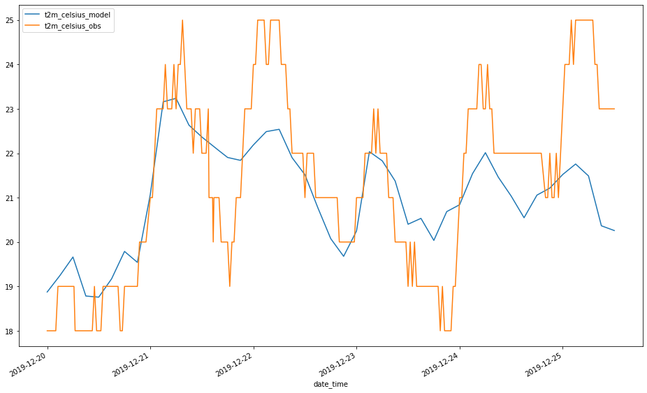
The observation data is given half-hourly but in integer value only. The prediction picked up the rise of temperature after simulated for 24 hours (2019-12-21). It could not predict the temperature drop on 2019-12-21 and the rise on 2019-12-22 very well. The temperature drop on 2019-12-22 and rise on 2019-12-23 looks satisfactorily simulated. However, after 2019-12-23 (already 72 hours of simulation), the features of high temperature rise in day time was not satisfactorily simulated.
There is another WMO weather station in Naha:
Changing part of the code to:
(my_lat, my_lon) = (26+12.0/60, 127+41.0/60)      # Naha WMO station
local_time_header = 'Local time in Naha'  # Column header in CSV file
local_time_offset = 9
my_csv = 'my_obs_data/47936.19.12.2019.25.12.2019.1.0.0.en.utf8.00000000.csv'
It produced the plot:
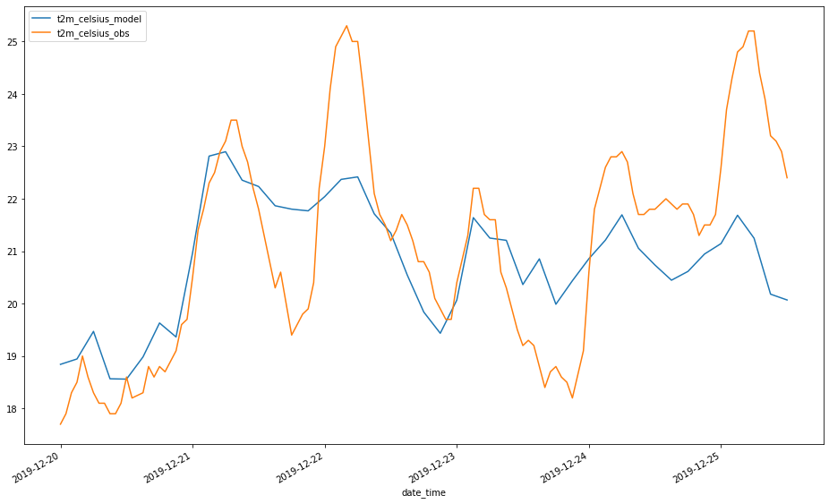
The temperature data of WMO stations are given to 0.1°C accuracy in hourly interval. The curve looks less distracting. The predicted temperature at the WMO station, about 3km inland from the airport station, looks similar to that for the airport but you may notice a little difference.
Is there a way to do a more decent prediction? Stay tuned for Part 3!
[Edit 3 Sep 2020: I can't finish the Part 3 blog article for Okinawa after the COVID-19 out-break, and I'm busy on other duties... everybody could understand. Well, in my colleagues' simulation for Typhoon Higos, he used a more decent mesh and more computational resources, and made a more decent prediction. See their blog article.]