Result Visualization
1. Spawn your Jupyter notebook server
From the top menu, click “Visualization”.

You shall see
Note: If you idle your browser for too long, you may see an error message like “401 Unauthorized”. Go back to console.cpas.earth (click the “Back” button in your browser), sign-in and try again.
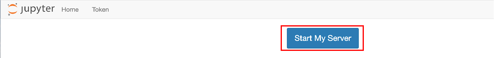
Click “Start My Server”, and wait a few seconds for the progress bar for spawning the server to complete, you will see:
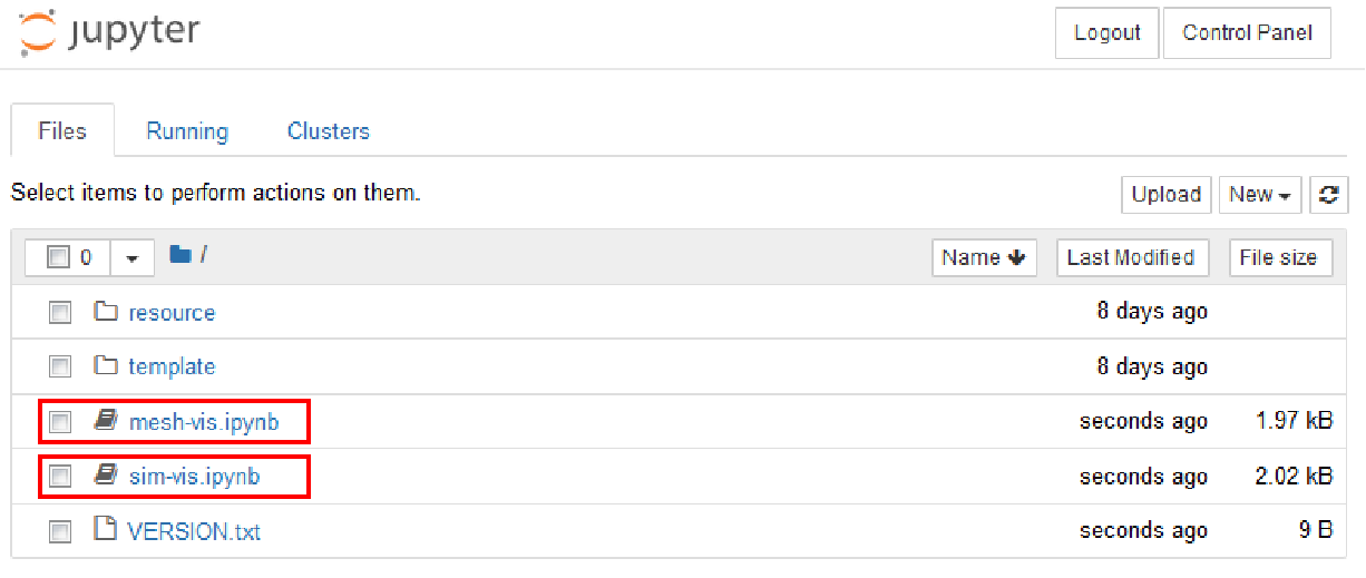
For visualization of mesh, double click “mesh-vis.ipynb”.
For visualization of real simulation results, double click “sim-vis.ipynb”.
2. Mesh visualization
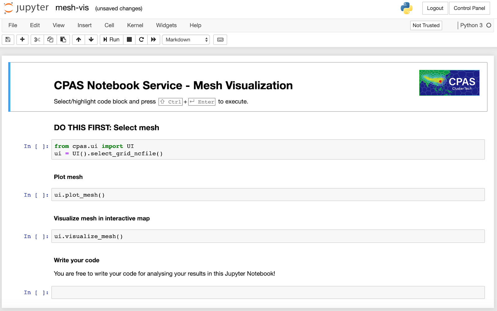
After opening “mesh-vis.ipynb”, you will see:
2.1 Select mesh
Following the instruction on the notebook, highlight the code block with select_grid_ncfile() and press Ctrl+Enter. A set of widgets for selecting the mesh to visualize will appear. You may select the mesh generation job you submitted.
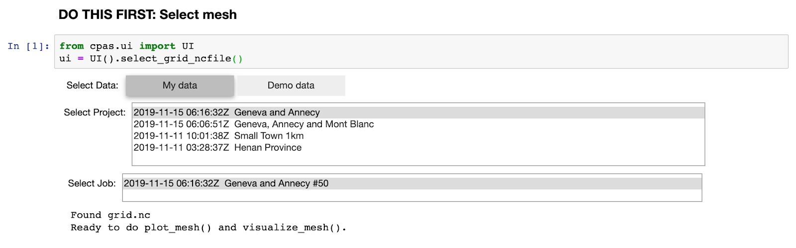
Alternatively, if you have not submitted any mesh generation job, you can try the Demo data:
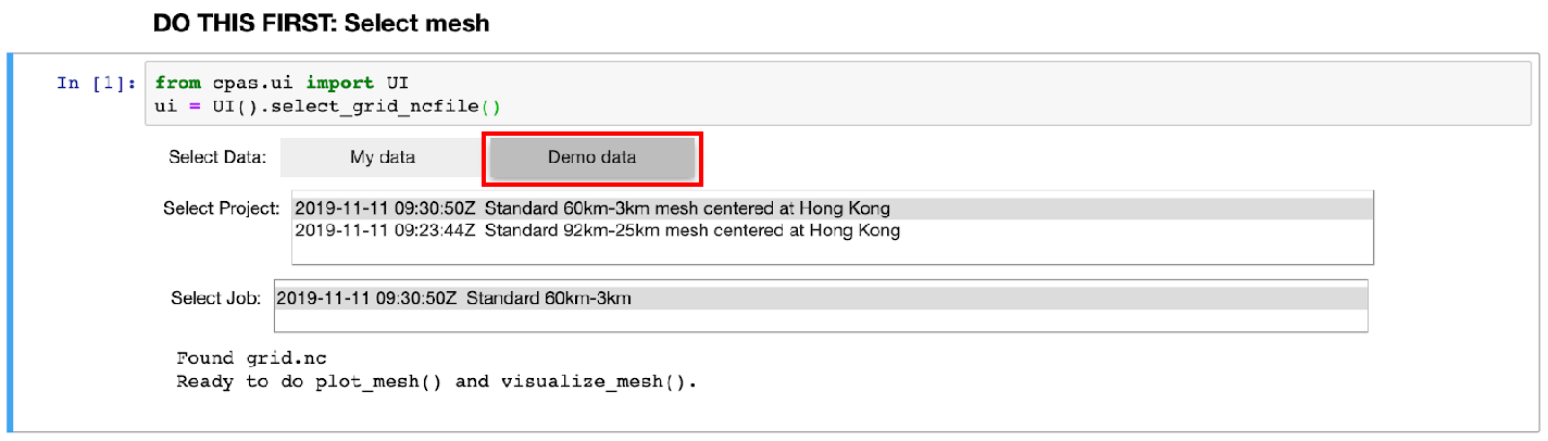
The demo data consists of MPAS-A’s standard 60km-3km mesh (835,586 cells, slower response because of more processing) and 92km-25km mesh (163,842 cells, faster response) rotated to center on Hong Kong.
2.2 Plot mesh
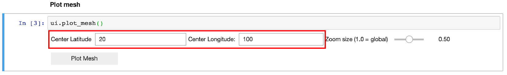
Highlight the code block with plot_mesh() and press Ctrl+Enter. A set of widgets appear for you to specify the options on the scope to plot. Enter the latitude and longitude for the center and drag the slider to zoom.
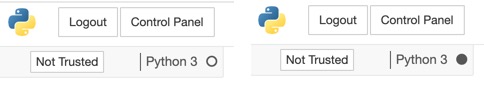
Then click the “Plot Mesh” button. Note that there is a circle beside the label “Python 3” near the top right corner. If the circle turns black, it means that the Python 3 kernel in the backend is processing the data.
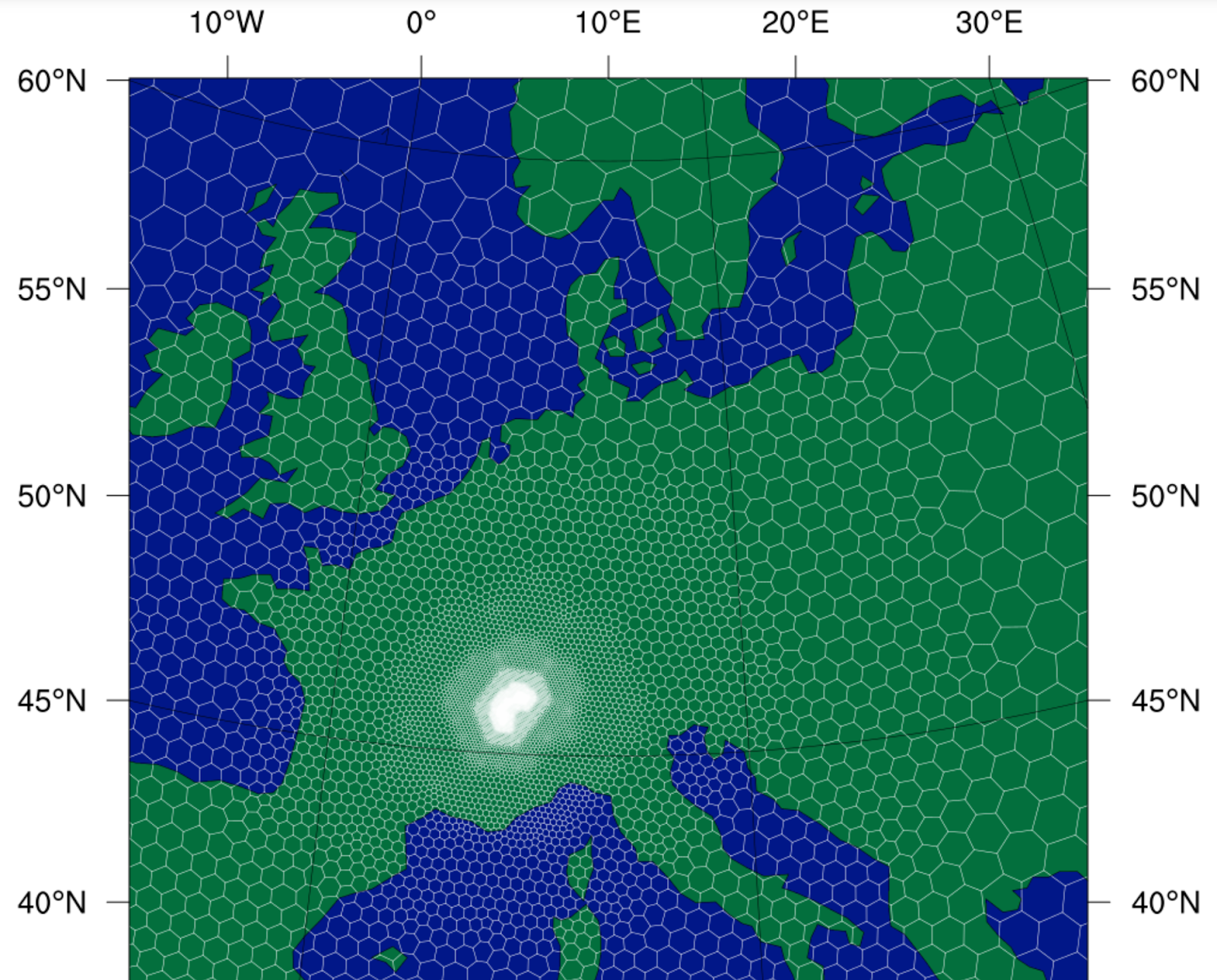
After a while, the plot will appear.
It consists of brief outline of the continent. For more details of geographical information, please use visualization of mesh in interactive map.
2.3 Visualize mesh in interactive map
Highlight the code block with visualize_mesh() and press Ctrl+Enter. A progress bar on loading will appear, and after loading completes, you will see:
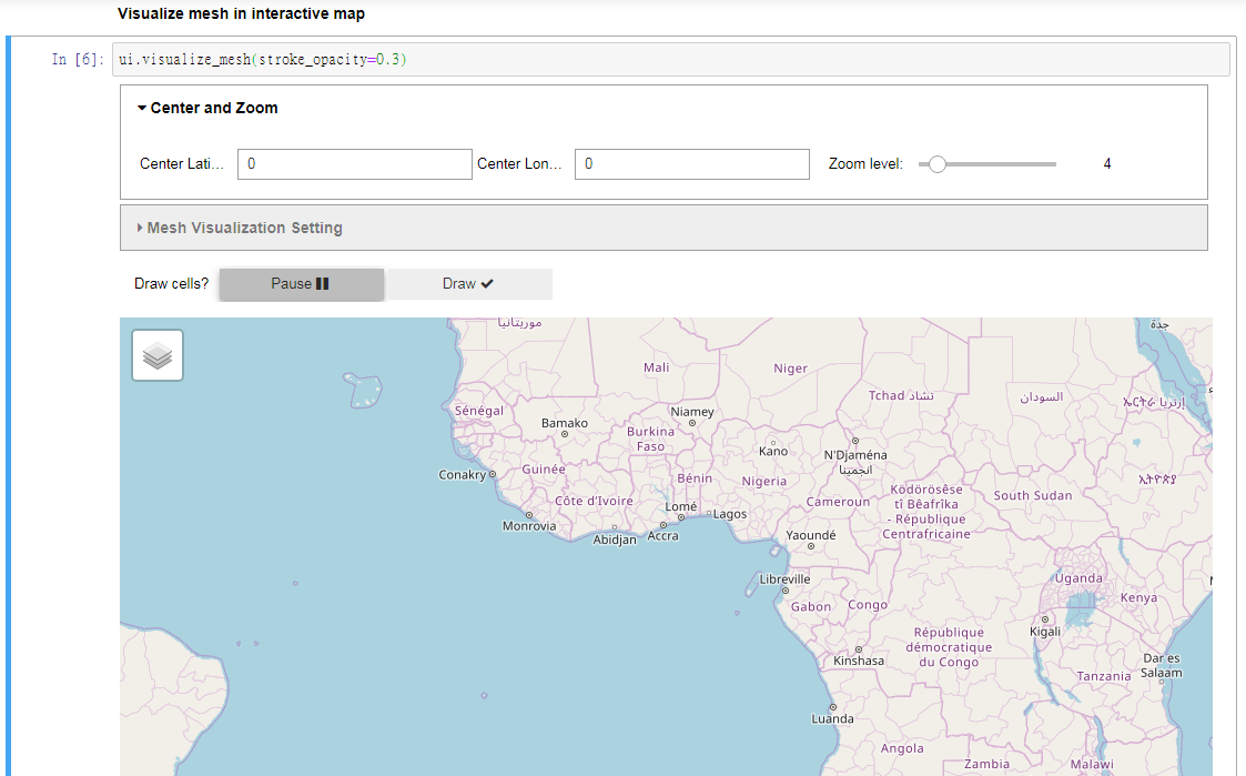
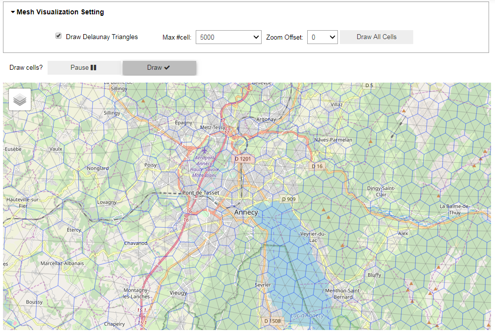
The interactive map is in Pause state. You are expected to drag and zoom in the map to the location you are interested. Then, click the Draw button to toggle to auto-redraw the state.
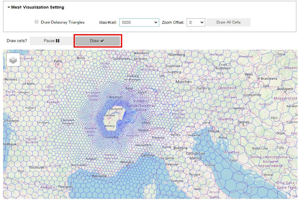
With the initial default setting, drawing of the cells on the map may take a few seconds. However, if regions with no cells drawn appear, it’s because we have set a limit on the maximum number of cells to draw in order to keep your browser responsive. The drawing algorithm selects cells of appropriate size to draw, and avoids drawing cells that stick together and form a patch.
Zooming in, the system will take some time to redraw and you will see results similar to:
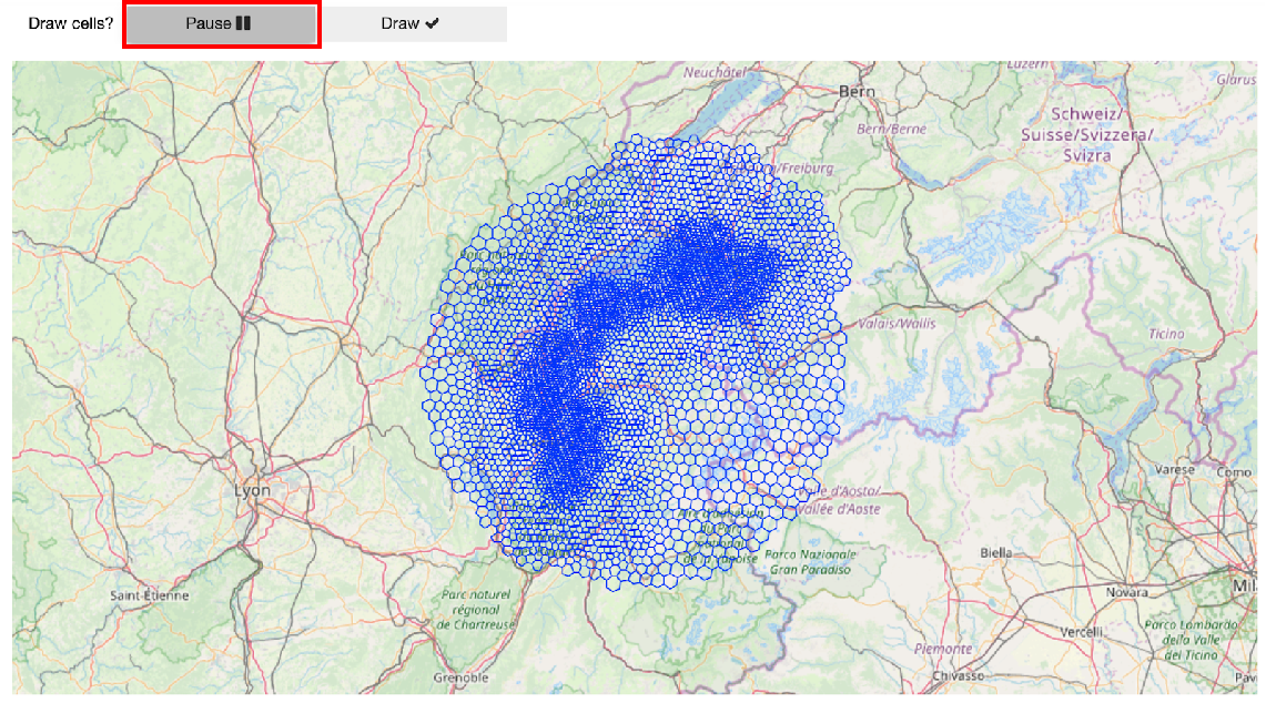
All cells of interest appear now, and you can continue to zoom in. You can also click the “Pause” button before zooming in in order to make the browser respond faster.
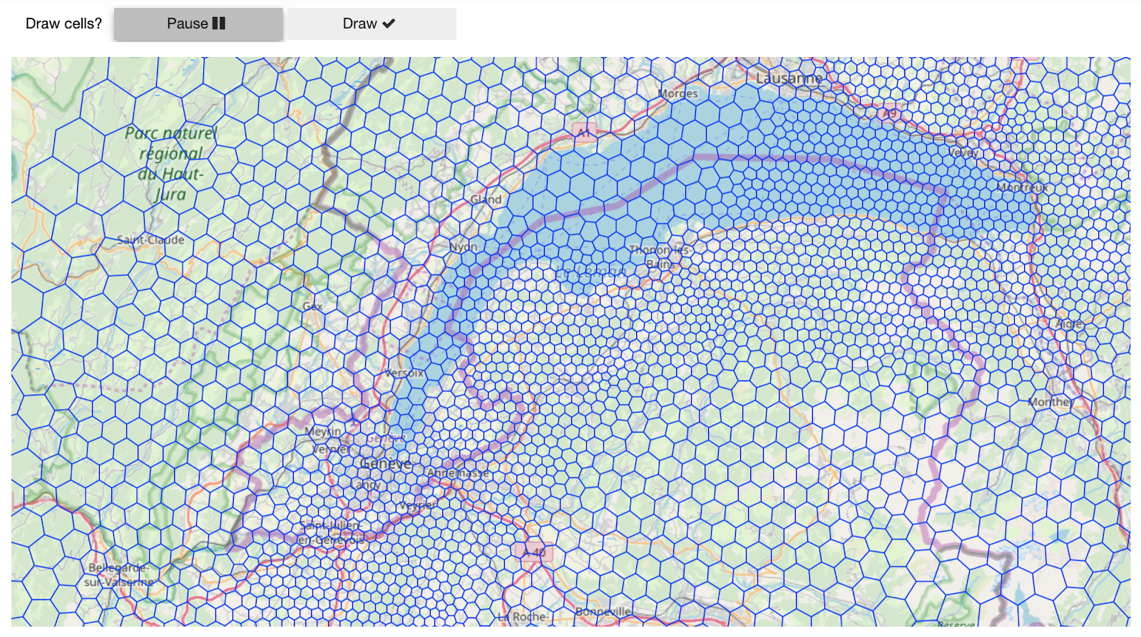
(This is Geneva Switzerland! CPAS technology was firstly announced here at Meteorological Technology World EXPO 2019.)
In case you would like to fine-tune the interaction behaviour, open the Mesh Visualization Setting accordion. Max #cell is the limit mentioned earlier. Setting it to a larger value plots more cells but slows browser response time. Zoom Offset controls the choice of sizes of cells to appear. The “Draw All Cells” button disregards the limit on the number of cells, but will be very small if the number of cells is large.
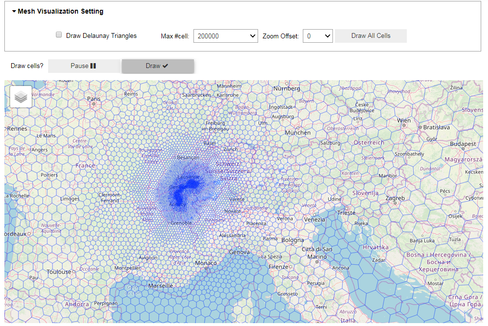
Last but not least, “Draw Delaunay Triangles” (light grey) helps you inspect the quality of the mesh (whether the triangles are close to equilateral, or if any obtuse triangle exists).